North Wales Photographic Association
Cymdeithas Ffotograffig Gogledd Cymru
Member of the Photographic Alliance of Great Britain
- Home
- About us
- Documents
- Calendar
- Competitions
- Exhibitions & Salons
- NWPA Handbook
- Events
- External Links
Latest News
Dont miss any of our Newsletters - Subscribe NOW

NWPA PDI Challenge 2025
An overview of the day can be downloaded here
All the Club Scores can be viewed HERE
All the Subject Scores can be viewed HERE
Aneurin Phillips - Kenya 2025 - Click here to download his adventure in hs own words and photos.
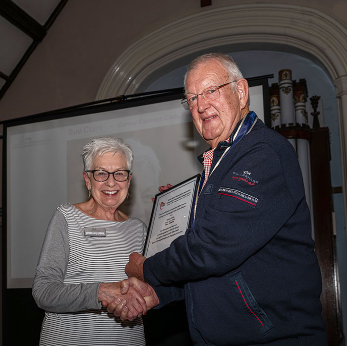
Sue Clark HonNWPA
Congratulations to Sue Clark on receiving and HonNWPA award for exceptional services , Here's Sue receiving her award from president Charles Meadows at Conwy camera Club
Nomination for Susan Clark for NWPA Hons:
Sue has made a rich and varied contribution to amateur photography in North Wales since she joined Conwy Camera Club in 2010. She is always in great demand as a speaker and a judge across North Wales and further afield. She is a highly competent photographer and has a passion for the history of photography and photographic techniques having embraced Photoshop since its infancy.
Despite being one of the largest clubs in North Wales over the last 20 years, Conwy has produced relatively few competition judges. Sue is a very well respected judge throughout North Wales and beyond and is known to be scrupulously fair, always well prepared and highly professional. Feedback from clubs where she has judged is always positive! The Club is grateful to Sue for her tireless work as a judge and proud of her experience and expertise and is proud of the high esteem in which she is held.
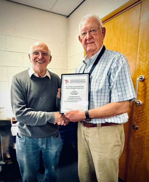
John Smith HonNWPA
Well done and congratulations to John Smith Hon NWPA! here's the man himself receiving an Honourable NWPA award for exceptional service, from President Charles meadows at the NWPA exec meeting this afternoon, for or all the work he does behind the scenes and his tireless work for the NWPA print and PDI battles including pre and post show involvement as well as on the actual day ! this includes creating an AV slideshows for clubs to present to their members to view at their leisure.
John visits many other clubs affiliated to the NWPA by going along and sharing his knowledge and giving various presentations, John is also an NWPA judge and gladly gives his time and evenings ,sharing his skills and knowledge for the benefit of others, he is also the delegate for Rhyl Photographic Society at the NWPA meetings, the secretary for Rhyl Photographic Society and is the webmaster for an AV group he belongs to in Cheshire and is extremely involved in.
John is a great asset for the NWPA, Rhyl Photographic Society and the North Wales photography scene and deserves this award as recognition for all his hard work over the years!
Christine Langford HonPAGB
A huge, and well deserved, Congratulations to Christine Langford, who has been awarded the prestigious JS Lancaster Medal by the PAGB, the highest honour they hand out to individuals, for all the years of hard work, not only to the PAGB … but also the NWPA, Eryri PS and Dwyfor CC. She was awarded the honour by Peter Young, Vice president of the PAGB, in front of friends at the Eryri PS meeting. She was taken aback at being awarded this honour, and a few tears were shed.
Christine has been the Oracle within the NWPA, always willing to help and hand out advice. Always working in the background at most of the events NWPA run, and always at hand on the day of the events…..this also reflects within the Eryri PS, she runs it….all by herself.
Info: The J S Lancaster Medal was instituted in 1998 to recognise exceptional service to the PAGB, and is named after its first Secretary. Award holders may use the designation ‘HonPAGB’, replacing any previous award of APAGB.

PAGB CES system info...
An long article regarding the PAGB's CES system, can be found on their latest E-News (358) on pages 10-12. download it by clicking here.
What Judges Look For
This is a guide to finishing off your photograph and give judges as little as possible to complain about! It is not about composition, or light or even subject matter. That is all up to you! But it should help you to spot niggly things that lose you marks. I am far from an expert at using Photoshop (PS) so most of the remarks here require only a basic knowledge and skill which can be learnt with practise and the help of your fellow club members.
This is only a guide - a list to jog your memory and you will have to interpret the solutions to suit your picture. Below are a set of useful check-boxes which may be of help - before you make your final print/image for presentation.
Note that for Wildlife and Travel you will need to abide by the latest rules for these sections. However, remember that wildlife and travel images may be submitted and altered in the Open section.
Cropping - probably the first and one of the most important things you will do. Think about it:
Have you cropped out marginal distractions?
Have you cropped to place the subject in a strong position in the image?
Are there areas in your picture that do not enhance the overall image?
Example: foreground areas of vegetation with little interest, out-of-focus foreground, or a large area of the picture with nothing in it.
Are you cropping to fit a standard mount?
Advice: Please don't. This is one of the most common faults and judges constantly have to say that there are/were better ways if displaying your picture. By using pre-cut mounts you are confining your print to a standard format which may not suit the subject. For example a letterbox shape may be more suitable, or a square format (the latter can be very attractive). You would not confine yourself in this way for a PDI.
Subject - The part/parts of the image that the story is about and the viewer is drawn to - usually forms part of the title:
Does the subject stand out from the background?
Suggestion: use correct aperture at time of shooting.
Use PS to diffuse the background.
Darken or lighten the background compared to the subject.
De-saturate the background or alter the colours.
Are there any burnt-out areas on the subject, or areas with no detail?
Suggestion: use the lasso tool to isolate the faulty area and adjust exposure,
or use low opacity clone tool to cone-in missing detail.
Does the subject have background objects conflicting with it (posts out of head etc)
Suggestion: move the subject in PS or clone out the offending object.
Background - the part of the image that so often gets forgotten when shooting:
Does it conflict with the subject?
Suggestion: see subject section above.
Are there any bright areas to draw the viewer's eye?
Suggestion: tone down or clone out the bright areas.
Cover with a foreground subject.
Are there any bright colours to conflict with the subject or draw the viewer's eye?
Suggestion: change the colour and/or tone it down or clone it out.
Is it a complicated/busy background?
Suggestion: change or simplify the background or look to see if you have a simpler image to use.
Is the horizon level? A common mistake in seascapes.
Suggestion: In PS use the blue lines that can be dragged across the image from the rulers.
Technical - Focus, Over sharpening, Over saturation, etc.
Focus - Is your picture really sharp? There may of course be reasons to deliberately soften the
image, but the original should be sharp.
Reason: it could be camera shake - have a look at the metadata and see what exposure you used and correct in
future or use a tripod.
Reason: it could be that the autofocus locked on to the wrong part of the image - try manual focus. You cannot
correct an out-of-focus image by sharpening in PS.
Reason: You may have enlarged the picture too much for the quality of your equipment. This is a very common
fault and will lose you lots of marks. Print smaller and do not try to fill a pre-cut mount or sheet of expensive
A3 paper.
Note! in wildlife photography a judge will insist that the image is sharp, except in cases where depth
of field will not allow the subject to be completely in focus such as in macro-photography, or
perhaps the tips of wings in a flying bird. Some allowance will occasionally be given.
Over sharpening - a very common fault causing pixilation and lines around objects.
Suggestion: look very carefully with a magnifier if possible and look particularly where dark objects meet the
sky. You can carefully clone these lines out, but it takes patience.
Over saturation - often caused by increasing the contrast too much as well as just by increasing the
saturation slider.
Suggestion: does the picture look natural when you view it. Try and compare it with other photographers'
images or ask the advice of other people. View the print in overcast daylight, not artificial light.
Colour casts - you MUST view a print in daylight, or under a daylight bulb, not in artificial light.
Colour casts are very difficult to resolve and it takes practise and experience to even recognise them.
To some photographers it comes easier than others. They are particularly noticeable in B&W
pictures which should always be viewed in natural light, preferably on an overcast day. Magenta is
the most common. Printing on different papers can cause a colour cast particularly with fine art
papers.
Black and White - there are so many ways of converting a colour image to B&W that they cannot be
explained here. The art of B&W seems to have been lost with the change from darkroom to digital
and judges frequently have to deal with poorly converted images.
Advice: get hold of, or keep by you a well produced B&W print (preferably a darkroom print) and use this as a
guide when converting your image from colour. You will be surprised how helpful this is. ALWAYS check the
final image in natural light (see above).
HDR, filters and other specialist software - have you used any of these and if so does it really
enhance your picture?
Advice: be sure you understand what you are doing when using these aids. They are easily overdone. A typical
example is the number of portraits we see where the skin looks like a piece of old leather!
Suggestion: Keep your original image on a layer beneath the modified one and blend them using 'opacity' in PS.
Presentation - Paper, borders and mounts.
Is your picture printed too large?
Advice: This is a common fault. Look carefully at your print. Can you see pixels? Remember if the image is at
the limit of your equipment it is better to print smaller when it will look sharper. A3 paper is expensive and
there is the temptation to try and fill the paper with your picture. Give your picture room in the mount - it looks
so much better than with a narrow mount margin.
Does the paper you are using suit the subject?
Advice: Think about the paper you choose to use. There are many papers out there - don't be afraid to try
some. An artistic subject may require a fine art paper, mat and/or textured. An architectural subject may be
better on a full gloss paper. Some papers suit B&W photographs.
Are you using a ready-cut mount?
Advice: It is not advisable to use ready-cut mounts. By doing so you are confining yourself to a standard
cropping regime which may not suit your picture (see CROPPING above).
Have you got a fancy border around your picture?
Advice: Unless you are confident that your border enhances your picture, keep your border simple using the
mount as the frame. It gives the judge less to criticise. DO NOT use a wide white border/keyline around a PDI.
Either use no keyline or a one, two or three pixel line depending on the final production size.
Are you using a coloured mount (including black)?
Advice: Fashions change, but at present avoid coloured mounts unless you are confident you know what you
are doing. Stick to white or ivory mounts. Black mounts can sometimes help to make B&W pictures 'stand out'.
Double or single mounting?
Advice: If single mounting use ARTISTS FRAMING TAPE, not masking or parcel tape. The latter tapes can
damage your competitor's prints.
The Title - The title is a compulsory part of the picture and while some judges say that it is unimportant
and the picture should speak for itself, a good title helps the judge understand what the
photographer is trying to say and is certainly helpful when the subject is obscure.
Does your title express the main point of the picture?
Advice and examples:It is no use calling your picture 'Approaching Storm' if the sky only forms a tiny part of the image and is not very
threatening or - 'Walking the dog' if the man and dog can hardly be seen in the picture, or - 'Reflections' when
the main part of the picture is a straight scene or - 'The Frightened Widow' when the expression on the subjects
face looks anything but frightened . Of course there are always exceptions to the rule. Rules are there to be
broken, but need a lot of experience on behalf of the photographer to be carried out well.
Ed Cloutman
WPF Judges and Presenters Secretary
Update 10:04:2017